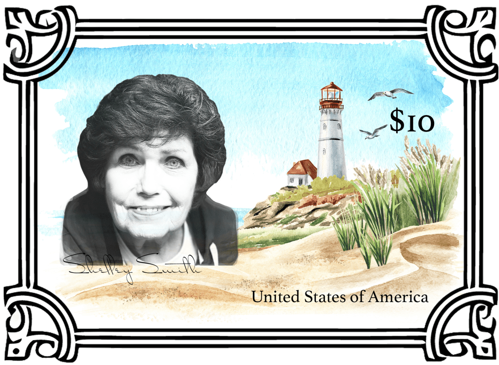
I really enjoyed creating this stamp. I looked at other stamp examples, and I found that the text was really simple and boiled down, which absolutely makes sense for such a compact design. So I kept the text really simple and had the price be one of the things that stood out the most, which seemed to be common in stamp design. I made the $10 larger than the other text, and the first text seen if people are viewing the stamp in a “z” pattern. The price is also framed by the image of the lighthouse, snug between the seagulls and the grass.
Personal Brand Sticker